A beginner's guide to Machine Learning with R
Introduction
In this tutorial we will be using the iris data set in order to create a simple line-by-line beginners guide to 4 different supervised machine learning classification models with the aim of prediction iris species based on a set of variables. This is intended to be a simple and easy guide for beginners who are just starting out with machine learning. We will learn how to create the following models:
- Decision Trees
- Random Forests
- Naive Bayes
- Support Vector Machines (SVM)
Creating machine learning models usually involves the following processes:
- Exploratory data analysis - exploring the data to find important patterns and to help out with feature engineering.
- Feature engineering - creating new variables out of existing ones.
- Handling missing values - deciding what to do with missing values in the data.
- Machine learning - creating predictive model.
- Prediction - using machine learning model to make prediction.
Usually steps 1-3 take the longest while actually creating the model takes much less time. For the purposes of this tutorial we will skip feature engineering and treating missing values as these steps are not necessary with our data, however, with real world data these steps are usually needed and also an important part of the process.
Load needed packages
First, we will load all packages that we will use for our analyses.
library(ggplot2) # Data visualization
library(plotly) # Interactive data visualizations
library(psych) # Will be used for correlation visualizations
library(rattle) # Graphing decision trees
library(caret) # Machine learning
Load the iris data set. This data set is part of the base data sets built-in in R, hence, we do not need to load it externally.
data("iris")
Taking a glance at the data
Lets check the first 6 rows as well as the summary statistics of our data to get a feel of how the data looks.
Head
head(iris)
##   Sepal.Length Sepal.Width Petal.Length Petal.Width Species
## 1          5.1         3.5          1.4         0.2  setosa
## 2          4.9         3.0          1.4         0.2  setosa
## 3          4.7         3.2          1.3         0.2  setosa
## 4          4.6         3.1          1.5         0.2  setosa
## 5          5.0         3.6          1.4         0.2  setosa
## 6          5.4         3.9          1.7         0.4  setosa
Summary
summary(iris)
##   Sepal.Length    Sepal.Width     Petal.Length    Petal.Width
##  Min.   :4.300   Min.   :2.000   Min.   :1.000   Min.   :0.100
##  1st Qu.:5.100   1st Qu.:2.800   1st Qu.:1.600   1st Qu.:0.300
##  Median :5.800   Median :3.000   Median :4.350   Median :1.300
##  Mean   :5.843   Mean   :3.057   Mean   :3.758   Mean   :1.199
##  3rd Qu.:6.400   3rd Qu.:3.300   3rd Qu.:5.100   3rd Qu.:1.800
##  Max.   :7.900   Max.   :4.400   Max.   :6.900   Max.   :2.500
##        Species
##  setosa    :50
##  versicolor:50
##  virginica :50
##
##
##
Exploratory data analysis
Lets do some exploratory data analysis to visually investigate and find patterns and insight into our data. This step can help us understand the data better and prepare us for creating our model later.
Correlation matrix
Lets create a correlation matrix using the pairs.panels() function from the PSYCH package to see how our variables correlate.
pairs.panels(
       iris[,1:4], # Our data.
       scale = TRUE, # Changes size of correlation value lables based on strength.
       hist.col = 'grey85', # Histogram color.
       bg = c("mediumseagreen","orange2","mediumpurple1")[iris$Species], # Colors of the Species levels.
       pch = 21, # The plot characters shape and size.
       main = 'Correlation matrix of Iris data')  # Title.
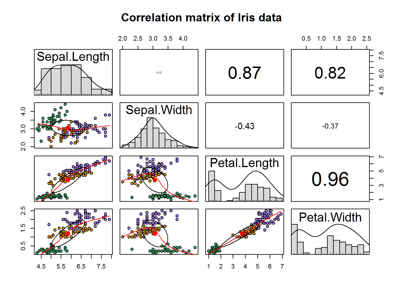
The upper part of the correlation matrix tells us the correlation between the variables and we can see that there is a moderate to strong correlation between all variables except for between sepal length and sepal width. Looking at the bottom half of the matrix gives us additional insight into not only the scatter plots of these correlations, but also divides the data points by iris species using colors. This allows us to see the clusters that are present among the species.
3D plot
Now we will create an interactive 3D scatter plot using plot_ly() from the PLOTLY package.
As our 3D plot is, well, 3 dimensional, we can only feed it 3 variables for the axes. As we have 4 variables I have decided to disclude sepal width from our plot as it seems to be the least important variable when looking at the individual variables (which we can see in tabs 3-6).
plot_ly(data = iris,  # Data
        x = ~Sepal.Length, y = ~Petal.Length, z = ~Petal.Width,  # X, Y, and Z variables. Put a tilde sign (~) before each variable name.
        color = ~Species,  # Color separation by Species.
        type = "scatter3d",  # Use a 3D scatterplot.
        mode = "markers"  # Use markers.
        ) %>%  # Pipe
        layout(
               scene = list(xaxis = list(title = 'Sepal length'), # Assign axes names.
                            yaxis = list(title = 'Petal length'),
                            zaxis = list(title = 'Petal width')))
This plot is very effective in showing us where our species place on the 3 variables, making it easier to gauge how close/apart they are clustered. We can, for example, see that the setosa data is in a quite isolated cluster, while versicolor and virginica, although also in quite clear clusters, show a slight overlap. These distinguishing clusters are a good sign for when we want to do our machine learning later as they will hopefully help our model in making good predictions.
Sepal width
Box plot of sepal width:
ggplot(
       # (1) Set data; (2) Specify X and Y variables; (3) 'fill' color separates our Species levels.
       data = iris, mapping = aes(x = Species, y = Sepal.Width, fill = Species)) +
       geom_boxplot() +  # Specifies that we want a box plot.
       scale_fill_brewer(palette = 'Dark2') +  # Change color of box plots.
       theme_light() +  # Set light theme.
       labs(title = 'Box plot of sepal width for each species',
            x = 'Species', y = 'Sepal width')  # Assign a title, axis names.

From this box plot it can be seen that the setosa species has a higher sepal width median and interquartile range compared to the other two species. In contrast, the Versicolor and Virginica show quite a bit of overlap with each other in term of their interquartile range. This will make it harder for a machine learning algorithm to distinguish between the two species levels when predicting using this variable.
Sepal length
Box plot of sepal length:
ggplot(data = iris, mapping = aes(x = Species, y = Sepal.Length, fill = Species)) +
       geom_boxplot() +
       scale_fill_brewer(palette = 'Dark2') +
       theme_light() +
       labs(title = 'Box plot of sepal length for each species',
            x = 'Species', y = 'Sepal length')
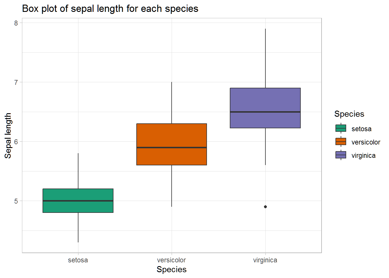
The ranges of the three species seem to somewhat overlap on the sepal length variable. However, their medians seem like they differ (at least visually. We don’t know if they’re statistically significantly different–we could test for this, but it is not necessary for the purposes of this kernel).
Petal width
Box plot of petal width:
ggplot(data = iris, mapping = aes(x = Species, y = Petal.Width, fill = Species)) +
       geom_boxplot() +
       scale_fill_brewer(palette = 'Dark2') +
       theme_light() +
       labs(title = 'Box plot of petal width for each species',
            x = 'Species', y = 'Petal width')

This box plot seems to indicate quite a difference in petal width between the species.
Petal length
Box plot of petal length:
ggplot(data = iris, mapping = aes(x = Species, y = Petal.Length, fill = Species)) +
       geom_boxplot() +
       scale_fill_brewer(palette = 'Dark2') +
       theme_light() +
       labs(title = 'Box plot of petal length for each species',
            x = 'Species', y = 'Petal length')

This plot seems to indicate that the three species vary in terms of interquartile range on petal length. The setosa seems to have a very narrow interquartile range and have quite a lot shorter petal length compared to the other two species.
Data partitioning
Before we begin to train our machine learning model we need to divide our data set into train and test subset. The train set is used for teaching or “training” our machine learning model how to make predictions with our data, while the test data set is used to test our model on data it has not seen in order to see how it performs.
First, lets set a random seed. This will ensure that we will be able to replicate our results when we rerun our analysis.
set.seed(222)
Next, we will create train/test partition with createDataPartition() from the CARET package. This will split our data through random sampling within our species levels and give us the sampled index.
train_index <- createDataPartition(y = iris$Species,  # y = our dependent variable.
                                   p = .7,  # Specifies split into 70% & 30%.
                                   list = FALSE,  # Sets results to matrix form.
                                   times = 1)  # Sets number of partitions to create to 1.
Now we can split our data into train and test data using the randomly sampled train_index that we just formed.
train_data <- iris[train_index,]  # Use train_index of iris data to create train_data.
test_data <- iris[-train_index,]  # Use whatever that is not in train_index to create test_data.
Machine Learning
It is finally time to create our machine learning models in order to predict which category of species (setosa, versicolor, virginica) each iris flower belongs to. We will conduct supervised machine learning as the data we feed to train our algorithms includes which species the iris flowers belong to (i.e., it includes the answers). The opposit of this would be unsupervised learning, where the machine is not given answers to train on. Furthermore, the algorithms we run are classifiers, meaning that they predict which category the species belongs to. The opposit of this would be regression where one predicts continous variables.
For ease and simplicity’s sake the models are separated into different independent tabs so that you can pick whichever one you want to take a look at.
Decision tree
- Uses: classification and regression
- How it works: A decision tree uses input variables to create branches of decisions to ultimately derive a prediction. Figure 1 gives an easy to understand visualization of this process. Keep in mind that real life decision trees tend to be larger and more complex than this.
- Pros: (1) easy to interpret, (2) can handle both numeric and categorical data, (3) good at dealing with outliers, (3) doesn’t have assumptions regarding the data (e.g., the data distribution)
- Cons: (1) can overfit to train data, (2) susceptible to variance such that small input differences can result in different prediction models
Model the decision tree model with a 10 fold cross validation.
fitControl <- trainControl(method = "cv", number = 10, savePredictions = TRUE)
Create a predictor model with the train() function from the CARET package. Specify method = 'rpart' to run a decision tree model.
# Create model
dt_model <- train(Species ~ ., # Set Y variable followed by '~'. The period indicates to include all variables for prediction.
                     data = train_data, # Data
                     method = 'rpart', # Specify SVM model
                     trControl = fitControl) # Use cross validation
Check the predicted accuracy of our decision tree model by running it on resamples of our train data. Later we will test the accuracy of the model by running a prediction on our test data.
confusionMatrix(dt_model)
## Cross-Validated (10 fold) Confusion Matrix
##
## (entries are percentual average cell counts across resamples)
##
##             Reference
## Prediction   setosa versicolor virginica
##   setosa       33.3        0.0       0.0
##   versicolor    0.0       29.5       5.7
##   virginica     0.0        3.8      27.6
##
##  Accuracy (average) : 0.9048
The results here tell us that our average accuracy is 90.48% when testing our data on resamples of our training data. We can also see what was predicted correctly/incorrectly.
Check the importance of each feature in our model.
# Create object of importance of our variables
dt_importance <- varImp(dt_model)

# Create plot of importance of variables
ggplot(data = dt_importance, mapping = aes(x = dt_importance[,1])) + # Data & mapping
  geom_boxplot() + # Create box plot
  labs(title = "Variable importance: Decision tree model") + # Title
  theme_light() # Theme
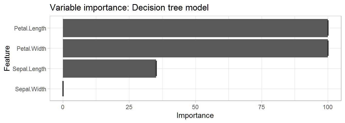 This table gives us a very informative overview of the importance of each variable in predicting the species.
Now lets plot the decision tree using fancyRpartPlot() from the RATTLE package. This will give us clear insight into how the model makes its predictions.
fancyRpartPlot(dt_model$finalModel, sub = '')
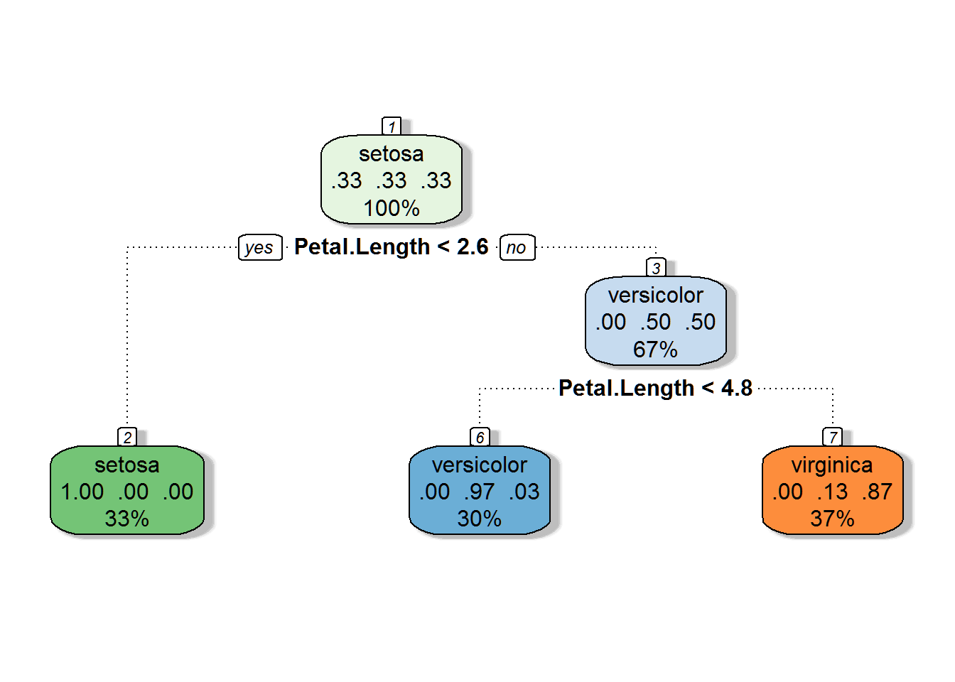
This decision tree tells us that:
- If petal length is smaller than 2.6, the prediction is setosa
- If petal length is between 2.6 and 4.8, the prediction is virginica
- If petal length is greater than 4.8, the prediction is versicolor
As we can see, petal length was the only variable that was needed to make these predictions.
PREDICTION: Decision tree model
Use the created dt_model to run a prediction on the test data.
prediction_dt <- predict(dt_model, test_data)
Check the proportion of the predictions which were accurate.
table(prediction_dt, test_data$Species) %>% # Create prediction table.
  prop.table() %>% # Convert table values into proportions instead of counts.
  round(2) # Round numbers to 2 significant values.
##
## prediction_dt setosa versicolor virginica
##    setosa       0.33       0.00      0.00
##    versicolor   0.00       0.31      0.00
##    virginica    0.00       0.02      0.33
As can be seen, 98% of the species classifications were predicted correctly.
- Final accuracy of the Decision Tree model: 98%
Random forest
Quick facts:
- Uses: classification and regression
- How it works: The random forest works by creating many decision trees and then averaging their outputs to derive a prediction. For classification problems this average will be the mode, while for regression problems this will be the mean. See Figure 2 for a visualization of this process.
- Pros: (1) good against overfitting (due to it averaging across many decision trees), (2) good at handling outliers, (3) can handle both numeric and categorical data, (4) flexible
- Cons: (1) difficult to interpret, (2) can be time-consuming compared to some other models
Create an object for a 10 fold cross validation. We will use this in our train() function to set trControl next.
fitControl <- trainControl(method = "cv", number = 10, savePredictions = TRUE)
Create a training model using train() from the CARET package.
# Create model
rf_model <- train(
                  Species ~ .,  # Set Y variable followed by "~." to include all variables in formula.
                  method = 'rf',  # Set method as random forest.
                  trControl = fitControl,  # Set cross validation settings
                  data = train_data)  # Set data as train_data.
Use the varImp() function to grab the importance of each variable in our random forest model and then plot them.
# Create object of importance of our variables
rf_importance <- varImp(rf_model)

# Create box plot of importance of variables
ggplot(data = rf_importance, mapping = aes(x = rf_importance[,1])) + # Data & mapping
  geom_boxplot() + # Create box plot
  labs(title = "Variable importance: Random forest model") + # Title
  theme_light() # Theme
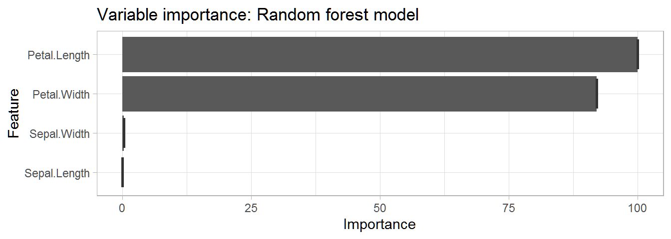 This plot tells us that petal length and width are the most important variable for prediction in our model.
Now, lets check the predicted accuracy of the random forest model by running it on resamples of our train data. Later we will test the accuracy of the model by running a prediction on our test data, which is data our model has not seen before.
confusionMatrix(rf_model)
## Cross-Validated (10 fold) Confusion Matrix
##
## (entries are percentual average cell counts across resamples)
##
##             Reference
## Prediction   setosa versicolor virginica
##   setosa       33.3        0.0       0.0
##   versicolor    0.0       29.5       2.9
##   virginica     0.0        3.8      30.5
##
##  Accuracy (average) : 0.9333
The output tells us that the predicted accuracy of our model is 94.29%. In addition, it also gives us a percentage matrix of species predictions against answers.
Prediction: Random forest model
We will now use our created random forest model in order to predict species on our test data (i.e., the data set our ‘machine’ has not seen before).
Use the created rf_model to run a prediction on the test data.
prediction_rf <- predict(rf_model, test_data)
Check the accuracy of our random forest model on our test data.
table(prediction_rf, test_data$Species) %>% # Create prediction table.
  prop.table() %>% # Convert table values into proportions instead of counts.
  round(2) # Round numbers to 2 significant values.
##
## prediction_rf setosa versicolor virginica
##    setosa       0.33       0.00      0.00
##    versicolor   0.00       0.33      0.00
##    virginica    0.00       0.00      0.33
100% of the species classifications were predicted correctly! It is important to note that this type of accuracy is rarely seen with real world data which is usually much more complex than our iris data set.
- Final accuracy of Random Forest model: 100%
Naive Bayes
Quick facts:
- Uses: classification
- How it works: The Naive Bayes model is a simple classification algorithm based on Bayes’ theorem. It naively assumes that all features fed into it are independent from one another and that they are equally important in predicting the outcome. Despite its simplicity it can be more effective than some more advanced algorithms.
- Pros: (1) requires little data for training, (2) useful for large data sets, (3) relatively fast
- Cons: (1) assumes features are independent and equal, something that is usually not the case in real life
Model the Naive Bayes model with a 10 fold cross validation.
fitControl <- trainControl(method = "cv", number = 10, savePredictions = TRUE)
Create a predictor model with the train() function from the CARET package. Specify method = 'nb' to run a Naive Bayes model.
# Create model
nb_model <- train(Species ~ ., # Set y variable followed by '~'. The period indicates that we want to use all our variables for prediction.
                     data = train_data,
                     method = 'nb', # Specify Naive Bayes model
                     trControl = fitControl) # Use cross validation
Check the predicted accuracy of our model by running it on resamples of our train data. Later we will test the accuracy of the model by running a prediction on our test data.
confusionMatrix(nb_model)
## Cross-Validated (10 fold) Confusion Matrix
##
## (entries are percentual average cell counts across resamples)
##
##             Reference
## Prediction   setosa versicolor virginica
##   setosa       33.3        0.0       0.0
##   versicolor    0.0       29.5       2.9
##   virginica     0.0        3.8      30.5
##
##  Accuracy (average) : 0.9333
The results here tell us that our average accuracy is 95.24% when testing our data on resamples of our training data. We can also see what was predicted correctly/incorrectly.
Use the varImp() function to grab the importance of each variable in our random forest model and then plot them.
# Create object of importance of our variables
nb_importance <- varImp(nb_model)

# Create box plot of importance of variables
ggplot(data = nb_importance, mapping = aes(x = nb_importance[,1])) + # Data & mapping
  geom_boxplot() + # Create box plot
  labs(title = "Variable importance: Naive Bayes model") + # Title
  theme_light() # Theme
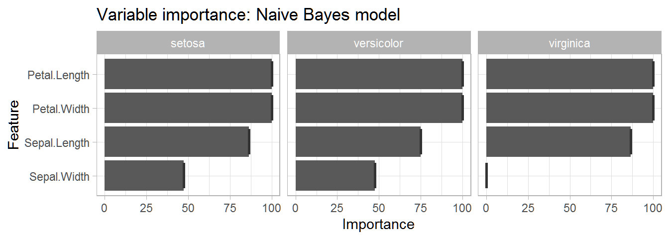 This table gives us a very informative overview of the importance of each variable in predicting each species. We can see that petal width and length are the two most important variables for predicting each species.
PREDICTION: Naive Bayes Model
Use the created nb_model to run a prediction on the test data.
prediction_nb <- predict(nb_model, test_data)
Check what proportion of the predictions which were accurate.
table(prediction_nb, test_data$Species) %>% # Create prediction table.
  prop.table() %>% # Convert table values into proportions instead of counts.
  round(2) # Round numbers to 2 significant values.
##
## prediction_nb setosa versicolor virginica
##    setosa       0.33       0.00      0.00
##    versicolor   0.00       0.31      0.00
##    virginica    0.00       0.02      0.33
Here we can see that 98% of the species classifications were predicted correctly.
- Final accuracy of Naive Bayes model: 98%
Support Vector Machine (SVM)
Quick facts:
- Uses: classification and regression
- How it works: One can conceptualize SVM by thinking of a graph where one dimension is added for each feature in the data. All the data points are then plotted in this n-dimensional space. SVM then classify data by creating optimal hyperplanes that divide the data into different categories. Figure 4 below gives a visualization of this process for data with two features in a 2-dimensional space.
- Pros: (1) effective when categories can be well divided through hyperplanes, (2) good at handling outliers
- Cons: (1) can be time consuming to conduct when there is a lot of data, (2) does not perform as well when categories overlap (making it harder for hyperplanes to divide the categories)
Model the SVM model with a 10 fold cross validation.
fitControl <- trainControl(method = "cv", number = 10, savePredictions = TRUE)
Create a predictor model with the train() function from the CARET package. Specify method = 'svmLinear' to run a SVM model.
# Create model
svm_model <- train(Species ~ ., # Set Y variable followed by '~'. The period indicates to include all variables for prediction.
                     data = train_data, # Data
                     method = 'svmLinear', # Specify SVM model
                     trControl = fitControl) # Use cross validation
Check the predicted accuracy of our naive Bayes model by running it on resamples of our train data. Later we will test the accuracy of the model by running a prediction on our test data.
confusionMatrix(svm_model)
## Cross-Validated (10 fold) Confusion Matrix
##
## (entries are percentual average cell counts across resamples)
##
##             Reference
## Prediction   setosa versicolor virginica
##   setosa       33.3        0.0       0.0
##   versicolor    0.0       28.6       1.0
##   virginica     0.0        4.8      32.4
##
##  Accuracy (average) : 0.9429
The results here tell us that our average accuracy is 96.19% when testing our data on resamples of our training data. We can also see what was predicted correctly/incorrectly.
Use the varImp() function to grab the importance of each variable in our random forest model and then plot them.
# Create object of importance of our variables
svm_importance <- varImp(svm_model)

# Create box plot
ggplot(data = svm_importance, mapping = aes(x = svm_importance[,1])) + # Data & mapping
  geom_boxplot() + # Create box plot
  labs(title = "Variable importance: Support vector machine model") + # Title
  theme_light() # Theme
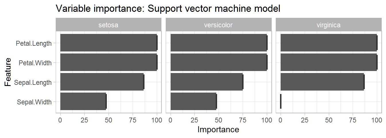 This table gives us a very informative overview of the importance of each variable in predicting each species. We can see that petal length and petal width are the two most important variables for predicting each species.
PREDICTION: Support Vector Machine
Use the created svm_model to run a prediction on the test data.
prediction_svm <- predict(svm_model, test_data)
Check the proportion of the predictions which were accurate.
table(prediction_svm, test_data$Species) %>% # Create prediction table.
  prop.table() %>% # Convert table values into proportions instead of counts.
  round(2) # Round numbers to 2 significant values.
##
## prediction_svm setosa versicolor virginica
##     setosa       0.33       0.00      0.00
##     versicolor   0.00       0.33      0.00
##     virginica    0.00       0.00      0.33
100% of the species classifications were predicted correctly. Nice!
- Final accuracy of the Support Vector Machine model: 100%
Result comparison
Table of results:
| Machine learning model | Predicted Accuracy | Tested accuracy |
|---|---|---|
| Decision tree | 90.48% | 98% |
| Random Forest | 93.33% | 100% |
| Naive Bayes | 93.33% | 98% |
| Support Vector Machine | 94.29% | 100% |
For our data it looks like the random forest and support vector machine models performed the best.
*Thank you very much for checking out my tutorial!
Further reading
Decision Trees
https://towardsdatascience.com/decision-trees-in-machine-learning-641b9c4e8052
https://medium.com/greyatom/decision-trees-a-simple-way-to-visualize-a-decision-dc506a403aeb
Random Forests
https://medium.com/(williamkoehrsen/random-forest-simple-explanation-377895a60d2d?)
https://www.stat.berkeley.edu/~breiman/RandomForests/cc_home.htm
Naive Bayes
https://www.analyticsvidhya.com/blog/2017/09/naive-bayes-explained/
Support Vector Machines
https://www.analyticsvidhya.com/blog/2017/09/understaing-support-vector-machine-example-code/
https://towardsdatascience.com/support-vector-machines-svm-c9ef22815589